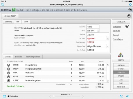
This is our estimates screen on the iPad (it’s still in progress so bear with us). If you are in the field with your client, you might find this useful to close a new deal. Click the screenshot to see a decent full-sized version. Notice the 3 PDFs you can create with one tap from the sidebar: an Estimate, a budget and an Estimate Status report. If you are an account exec or owner, you don’t always have that computer with you or you don’t want it sitting in your meeting creating a barrier between you and your client. You can create new estimates on the fly (away from your desk or out in the world) with just your iPad from the Jobs entry screen.
SM13 on the Desktop. We know most creative services groups are interested in Mac features of Studio Manager, and we will pause here to get to that. But, we’ve all seen Yosemite and iOS8 and can see that iPads and even iPhones (especially that rumored mondo 5.5″ one) are going to be key productivity tools. So, we continue to go full speed ahead on this new FileMaker Go piece of Studio Manager 13.
Theming Studio Manager. But keep in mind, the vast majority of our Studio Manager 13 work has been on the desktop version. We have 400+ layouts for entry screens, reports, dialogs, list screens and table views for just the desktop and less than 100 for iPad and iPhone.
FileMaker 13 lets you create custom themes with object styles to allow you to change the look of a field or screen everywhere with one selection. There’s no CSS to worry about. You just select attributes like font type and size for the object type you want to style. One more click changes every object of that type throughout Studio Manager 13. However, all of this power depends on some up front work. There are a few default styles and default object types but most of the UI objects, need to be assigned a style. For example, entry screen fields get the default field style. But so do list screen fields and portal fields. The problem is that portal fields should be transparent and entry screen fields shouldn’t. That’s what we’ve been doing for six months, inventing and assigning styles throughout our 400+ layouts.
So, you, my dear designer, don’t have to. You get to just change the object styles for an object type and throw the switch and rock and roll. This works on the iPad and iPhone entry screens and everywhere else in Studio Manager. All we ask is that you show us what your version of Studio Manager looks like (if you are willing). We would love to see Studio Manager looking off the charts cool.
By the way, if you want to imagine using this estimate entry screen or yesterday’s timesheet, navigate to this page on your iPad and tap the screenshot for a full size view.

